
Sonata brand and product kit
Brand and product kit

How Sonata looks, sounds and moves, packaged to help you build with it.
Two kits
What's inside
The delivery is two sections and a guidelines document. The brand kit is the identity and marcom layer, and the product kit is the React component library. Both read from the same set of values.
Brand kit
Identity and marcom
Positioning, voice and concepts. Brandmark, color, typography, layout, effects, graphic elements, art direction and motion. The tokens as plain CSS, the three faces as woff2, the logos and the flowers.
Product kit
Component library
Fifteen components in TypeScript, on a generated Tailwind theme. Badge, Band, Button, Bullet, Card, Checkbox, Dropdown, NumberBullet, ProgressBar, PromoCode, ScrollCue, ScrollRail, Stages, TextField and Toggle.
Guidelines
Getting started
Eight pages at the root of the delivery. What is in the kit, how to hand it to an agent, and how to get the first piece made. No coding experience needed to follow it.
Verbal
Positioning
Sonata is a concierge medical practice and health technology company, built from scratch for the AI era. Your doctor, not a dashboard: the deepest multi-omic testing, real physician-led care, and a plan focused on preventing disease before it starts.
Essence
We’ve got your back.
The irreducible core. Every piece of copy is a version of this sentence.
Promise
A care team deeply informed by your biology, delivering a plan uniquely yours, focused entirely on preventing disease before it starts.
Pillars
The foundation the brand stands on. A claim about the service traces back to one of these five.
The deepest understanding of your biology
Every barrier between you and your care, removed
Physicians and AI, built to work as one
Your full health picture, contextualized
A care plan built from your biology that compounds
Values
What the brand believes and how it behaves. These are the reasons behind the copy, not lines to publish.
Value
Guidelines are the floor, not the ceiling
Evidence-based, but it does not stop where the guidelines stop. When the research supports going further, it goes further.
Value
Health understanding is a right
Every person deserves to see their full biology. Not just “your labs are normal”, but the real picture, explained clearly.
Value
Prevention is a responsibility
Most disease that kills us is preventable. With the research and the capability to intervene early comes an obligation to do so.
Value
People want to do the right thing
Given the right information and the right plan, people will make the best choices for themselves and their families.
Value
The best care shouldn’t be reserved for the few
Concierge-level healthcare has existed for the ultra-wealthy. Everyone proactive about their health deserves access to it.
Value
Complexity is our problem, not yours
Scheduling, referrals, insurance, wait times, repeating your history. Sonata absorbs that friction so you never have to think about it.
Audience
Natural Health Optimizers
Enter from “I want to optimize my health”. Motivated by enhancement and upgrade. Promise them access to the healthcare system they actually want.
Audience
Forced System Navigators
Enter from “something’s wrong, but no one will help me”. Motivated by validation and relief. Promise them the answers they deserve.
Benefits
Three layers. A page leads with the emotional layer and proves it with the technical one.
Technical
Real doctors, real care. Deep multi-omic testing. Clinical AI engine. HIPAA compliance and privacy.
Functional
Biological understanding and depth. Personalized biomarker targets. Hospitable concierge experience. Longitudinal care. High value, accessible price.
Emotional
Trust. Clarity. Agency. Validation. Savvy. Relief.
Core brand lines
Five lines are approved for use. Reach for one of these before writing a new headline.
Healthcare Built for Your Biology
Where Deep Testing Meets Real Doctors
A Care Team That Already Knows You
Complex Insights, Clear Guidance
Your most valuable asset is you
Verbal
Voice
Sonata speaks the way a good clinician speaks to someone they know: warm, direct, unhurried, and specific about what happens next.
The italic rule
Review your info.
Italics fall on possessive adjectives, and nothing else: one word in a headline, never a whole line. The italic is what makes a sentence about the reader rather than about the product.
Principles
- Earns trust immediately
- Clinical without being jargon-y
- Says we got your back
- Never talks down
- Never induces fear
Tone
- Lead with emotion, prove with science
- Confident, never arrogant
- Concrete, not abstract
- Critical of the system, never the people in it
- Unapologetic, never petty
- Human warmth, never clinical-cold
- Proactive, never fear-based
Language
The word on the left carries the brand. The word on the right does not. Run copy against this table before it ships.
| Category | Use | Don’t use |
|---|---|---|
| Science | DNA, epigenetics, methylation, biomarkers, biological age | Genomic analysis, polymorphism, allele, SNP, phenotypic expression |
| Ambition | Preventive, proactive, healthspan, ahead of, depth, informed | Anti-aging, longevity, life extension, reverse aging, game-changing, revolutionary |
| Care | Doctors, care team, doctors who listen, someone on your side | Providers, care coordination team, assigned clinician |
| Hospitality | Experience, concierge, we come to you | Services, offerings, onboarding process |
| Precision | Personalized to your biology, your targets, your plan | Optimized, maximized, peak, dialed in |
| Understanding | Contextualized, your health story, explained, clear | Data, dashboard, insights, metrics, analytics |
| Emotion | Understood, heard, taken seriously, believed | Empowered, unlocked, transformed, wellness journey |
| Claims | 250+ biomarkers, whole-genome sequencing, clinically validated | World-class, best, comprehensive, unlike anything |
| Urgency | Preventable, actionable, here’s the plan | You could be sick, don’t wait, before it’s too late |
A few of the approved brand lines carry a word from the right column. The filter governs copy you write, not a line the brand has already set: quote an approved line exactly rather than editing it to pass. The kit names every one of those lines.
Examples
The same fact, written twice. The right column is what the category sounds like everywhere else.
| Tone | Say | Don’t say |
|---|---|---|
| Human warmth, never clinical-cold | Your care team already knows your history, your goals, and what matters to you. | Patients are assigned a dedicated care coordination team upon enrollment. |
| Confident through specificity | Most chronic disease is preventable. We give you the depth to catch it early and the care team to act on it. | You could be sick right now and not even know it. Don’t wait until it’s too late. |
| We got your back | The system runs 11-minute appointments and orders the same 20 labs. You deserve more. | Your doctor doesn’t care enough to look deeper. |
| Call out the grift without being petty | Your prescription was sent to the pharmacy before you finished the call. Your follow-up is already on the calendar. | Your results are now available. Schedule a follow-up appointment at your convenience to discuss next steps. |
Visual
Brandmark
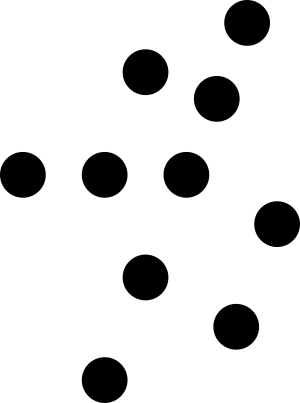
Three marks: the logotype, the symbol, and the lockup that joins them. The symbol is ten equal circles forming a simplified structure of the human body.



Clear space
Clear space on all sides equals the height of the logo. For the symbol it is half its width on each side, and half its height above and below.
Minimum size
Logotype and lockup 200px wide. Symbol 20px wide.
Over imagery
White, with the exclusion blend mode.
Visual
Typography
Three faces, each with a job. EB Garamond for headlines, Funnel Sans for body and interface, JetBrains Mono for eyebrows and detail. The job picks the face, never the look of a given line.
Headline
EB Garamond
Warmth and humanity.
Body
Funnel Sans
Clarity and structure.
Detail
JetBrains Mono
Precision.
Visual
Color
White is the canvas. Black carries high visibility in small amounts. Cosmic Latte is the defining brand color, used sparingly. Green, in limited use, introduces a calm and optimistic tone. Click any swatch to copy its value.
Core
Gray
Accent
Gradient
Status
Visual
Art direction
A flower is the ground a marketing surface is made of, not an image placed in it. Scale it past the surface so the edges crop the bloom, then pick a strength by how much copy the surface carries. The copy and the flower never compete.
The three strengths
Each tile runs the real recipe at the real numbers: the flower at 200 percent, rotated -30 degrees, at the strength’s own blend and opacity. The line over each one is the same, so the only thing changing is how much of it you can read.
The full story of your healthThe full story of your healthThe three states
A separate axis: how resolved the flower itself is. Content sits on the second or the third, never the first. Over a full flower it goes on a frosted panel instead.


The editing formula
How a new image is brought into the system. The shipped flowers are already at stage two, so they need only the third.
Stage one
The original image, on its own ground.
Stage two
The subject cut out, with the color warmed.
Stage three
The subject at 70% opacity, under a Cosmic Latte overlay.
Visual
Layout
Layout is a grid and a spacing scale, at two widths. Ask for a row of cards and the agent snaps them to the columns, then reflows them for a phone without being told the breakpoint.
You ask
Put the three care cards under the headline, and make sure it holds up on a phone.
The agent lays it out
On desktop each card spans 4 of the 12 columns, inside 80px margins and 24px gutters. On a phone the grid drops to 4 columns and 24px margins, so each card takes the full width and the cards stack 16px apart. Nothing is resized by eye.
Prevention-first care
Your health story begins today.
Private Blood Panel
Samples collected by lab
Welcome consultation
Dr. Emily Carter, Internal Medicine
Your care plan was approved by your clinician.
Dr. Emily Carter, Internal Medicine
Prevention-first care
Your health story begins today.
Private Blood Panel
Samples collected by lab
Welcome consultation
Dr. Emily Carter, Internal Medicine
Your care plan was approved by your clinician.
Dr. Emily Carter, Internal Medicine
The values the agent pulls from. Between the two widths, the desktop column count holds and the margin shrinks. Click any row to copy its token.
Spacing
| space-1 | 4px | 0.25rem | |
| space-2 | 8px | 0.5rem | |
| space-3 | 12px | 0.75rem | |
| space-4 | 16px | 1rem | |
| space-5 | 20px | 1.25rem | |
| space-6 | 24px | 1.5rem | |
| space-8 | 32px | 2rem | |
| space-10 | 40px | 2.5rem | |
| space-12 | 48px | 3rem | |
| space-16 | 64px | 4rem | |
| space-20 | 80px | 5rem | |
| space-24 | 96px | 6rem | |
| space-32 | 128px | 8rem | |
| space-40 | 160px | 10rem | |
| space-48 | 192px | 12rem | |
| space-56 | 224px | 14rem | |
| space-64 | 256px | 16rem |
Container
| container-sm | 640px |
| container-md | 768px |
| container-lg | 1024px |
| container-xl | 1280px |
Radius
| radius-none | 0px | |
| radius-xs | 4px | |
| radius-s | 8px | |
| radius-m | 12px | |
| radius-l | 16px | |
| radius-xl | 32px |
Border
| border-none | 0px | |
| border-hairline | 0.5px |
Visual
Effects
Depth comes from shadow, blur and inner light, never from a heavier border or a darker fill. Each effect below sits on the ground and the element it is written for. Click one to copy its token.
Visual
Motion
Interface motion is short and functional. Brand motion is long and atmospheric. The sequences below compose those moves the way a real surface runs them, at the numbers the kit ships, and each one plays as it scrolls in. The single moves sit underneath.
Choreography
Private Blood Panel
Samples collected by lab
Welcome consultation
Dr. Emily Carter, Internal Medicine
Your care plan was approved by your clinician.
Dr. Emily Carter, Internal Medicine
- 1200ms bloom The flower runs full, blurred, field. Content waits.
- 320ms enter The cards rise, 60ms apart.
Private Blood Panel
Samples collected by lab
Continue- 120ms exit The card gives under the press.
- 320ms standard Height and opacity open together.
- 320ms enter The action rises into the open panel.
Private Blood Panel
Samples collected by lab
Welcome consultation
Dr. Emily Carter, Internal Medicine
Your care plan was approved by your clinician.
Dr. Emily Carter, Internal Medicine
- 200ms exit The top row fades. Nothing travels.
- 320ms standard The space closes, and the rows below settle.
The moves
A color and shadow change under the pointer. Size never moves.
The surface gives by six percent, and returns on release.
An element rises twelve pixels into full opacity as it arrives.
The element fades out. Nothing travels on the way off.
Height and opacity open together, for a panel opening in place.
A list rises 60ms per row, and the delay stops growing at row 6.
The signature move at specimen scale. Three states, run in order: full, blurred, field.
Under reduced motion the field state renders directly and everything cross fades into place.
Product
Components
The TypeScript library itself, running in the page. Press the buttons, step through the stages, type into the fields: every state here is the one the library ships.
Product
Tokens
Every color token in the system, generated from the same source as the kit's CSS. The type, spacing, radius and effect tokens sit in the sections above. Click a row to copy its value.
| Token | Value | Group |
|---|---|---|
| --white | #FFFFFF | core |
| --black-900 | #2B2B2B | core |
| --cosmic-latte-100 | #FFF8E7 | core |
| --cosmic-latte-50 | #FFFBF3 | core |
| --cosmic-latte-25 | #FFFDF9 | core |
| --gray-50 | #F5F5F5 | gray |
| --gray-100 | #EDEDED | gray |
| --gray-200 | #E6E6E6 | gray |
| --gray-300 | #DBDBDB | gray |
| --gray-400 | #C7C7C7 | gray |
| --gray-500 | #B8B8B8 | gray |
| --gray-600 | #999999 | gray |
| --gray-700 | #666666 | gray |
| --gray-800 | #3D3D3D | gray |
| --gray-900 | #2B2B2B | gray |
| --white-80 | #FFFFFFCC | alpha |
| --white-50 | #FFFFFF80 | alpha |
| --black-900-80 | #2B2B2BCC | alpha |
| --black-900-50 | #2B2B2B80 | alpha |
| --black-900-20 | #2B2B2B33 | alpha |
| --sonata-blue | #1547C6 | brand |
| --lavender-500 | #9B7BFF | accent |
| --lavender-400 | #D1C3FA | accent |
| --lavender-300 | #EDE4FB | accent |
| --taupe-500 | #94775B | accent |
| --taupe-400 | #BDA48D | accent |
| --taupe-300 | #E7D5C5 | accent |
| --mint-500 | #1FBF8C | accent |
| --mint-400 | #7BD8BA | accent |
| --mint-300 | #CCEFE4 | accent |
| --amber-500 | #F78649 | accent |
| --amber-400 | #FFA97A | accent |
| --amber-300 | #FFDAC6 | accent |
| --coral-500 | #FF735F | accent |
| --coral-400 | #FF9B8D | accent |
| --coral-300 | #FFC9C1 | accent |
| --azure-500 | #369AF1 | accent |
| --azure-400 | #77C0FF | accent |
| --azure-300 | #D5EBFF | accent |
| --teal-500 | #3AC7CE | accent |
| --teal-400 | #88DEE2 | accent |
| --teal-300 | #CFF6F8 | accent |
| --error-red | #D62121 | status |
| --white | dominant | proportion |
| --black-900 | high-visibility, small amounts | proportion |
| --cosmic-latte-100 | defining, used sparingly for warmth and depth | proportion |
| --mint-500 | limited use, for a calm and optimistic tone | proportion |
| --gradient-cosmic | linear-gradient(to bottom, #FFF8E7, #D8F1E9) | gradient |
| --gradient-soft-1 | linear-gradient(to right, #FFFBF3, #F5EEFF) | gradient |
| --gradient-soft-2 | linear-gradient(to right, #FFFBF3, #D8F1E9) | gradient |
| --gradient-black | linear-gradient(to bottom, #171717, #2F2F2F) | gradient |
| --gradient-ai | linear-gradient(to right, #5585FF, #FF9484) | gradient |
| --gradient-warm-peach | linear-gradient(to top, #FFFCF4, #FBF3EF, #F8F3E9) | gradient |
| --gradient-periwinkle-haze | linear-gradient(to top, #FFFCF4, #F4F6FB, #F8F3E9) | gradient |
| --gradient-lavender-blush | linear-gradient(to top, #FFFCF4, #F8F4F6, #F8F3E9) | gradient |